Developing the Google Store Design System
Introduction —
I played a key role in defining Google Store’s first design system that unified commonly used components into libraries that improved the UX team’s workflow. It began as an effort to improve local team efficiency and evolved into a Store-wide initiative to improve overall resourcing across multiple cross-functional teams.
Role, Duration, Platform —
Co-Founder, 24 months, Web
Team —
2 other UX designers, UX Manager, Engineering Lead
Contribution —
Systems Thinking, Workflow Optimization, XFN Collaboration
Problem —
Integrate user-centered principles into Google Store’s Product Detail page structure to increase CTR and encourage page continuity.
Context —
Since 2019, Google Store was dedicated to scaling overall operations and making the business more efficient, focused
Google Store divided into 2 organizations: 1 team working on top-funnel pages and the other on bottom-funnel pages
UX presence only represented in the bottom-funnel team
Outcomes —
⭐️ Increased internal workflow efficiency among XFN teams
⭐️ New, critical alignment amongst siloed XFN teams
Product Strategy —
I began with Foundations, defining elements and building out system components with increasing complexity.
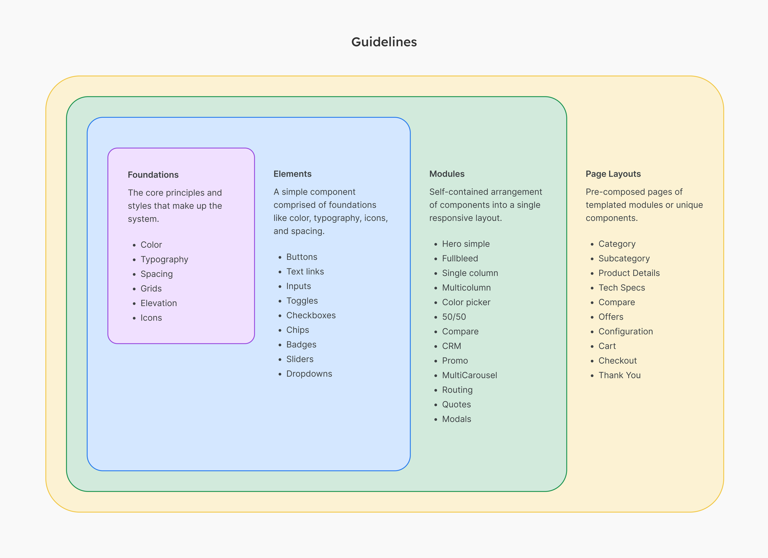
Foundations
One of the key initial steps was to cross-reference fundamental Google Store styling with established Google Material guidelines to identify common themes and departures given Google Store’s specific use cases as an e-commerce and retail product. Reaching alignment on a Typographic set was the largest theme to align on across Top and bottom funnel pages.
Elements
Developing and defining Elements was nearly a simultaneous activity with Foundations as these two act as the primary building blocks to construct any type of component. Google Store largely complied with many Material standards, but ensuring they were accessible was a notable step in finalizing this phase.
Modules
Establishing Modules was certainly the most arduous and time-consuming part of the library to make consistent, given the amount of alignment needed amongst Marketing, Creative, and Engineering teams that our UX team was not familiar with. We relied heavily upon a contract agency’s expertise and knowledge of these pages, given their primary role as page creators for top-funnel pages.
Page Layouts
Once Modules were established, Page Layouts came together smoothly. Also, because modules were mix-and-match and largely interchangeable, Page Layouts became a strong suggestion from a guidelines standpoint, knowing that small areas of customization were always expected.
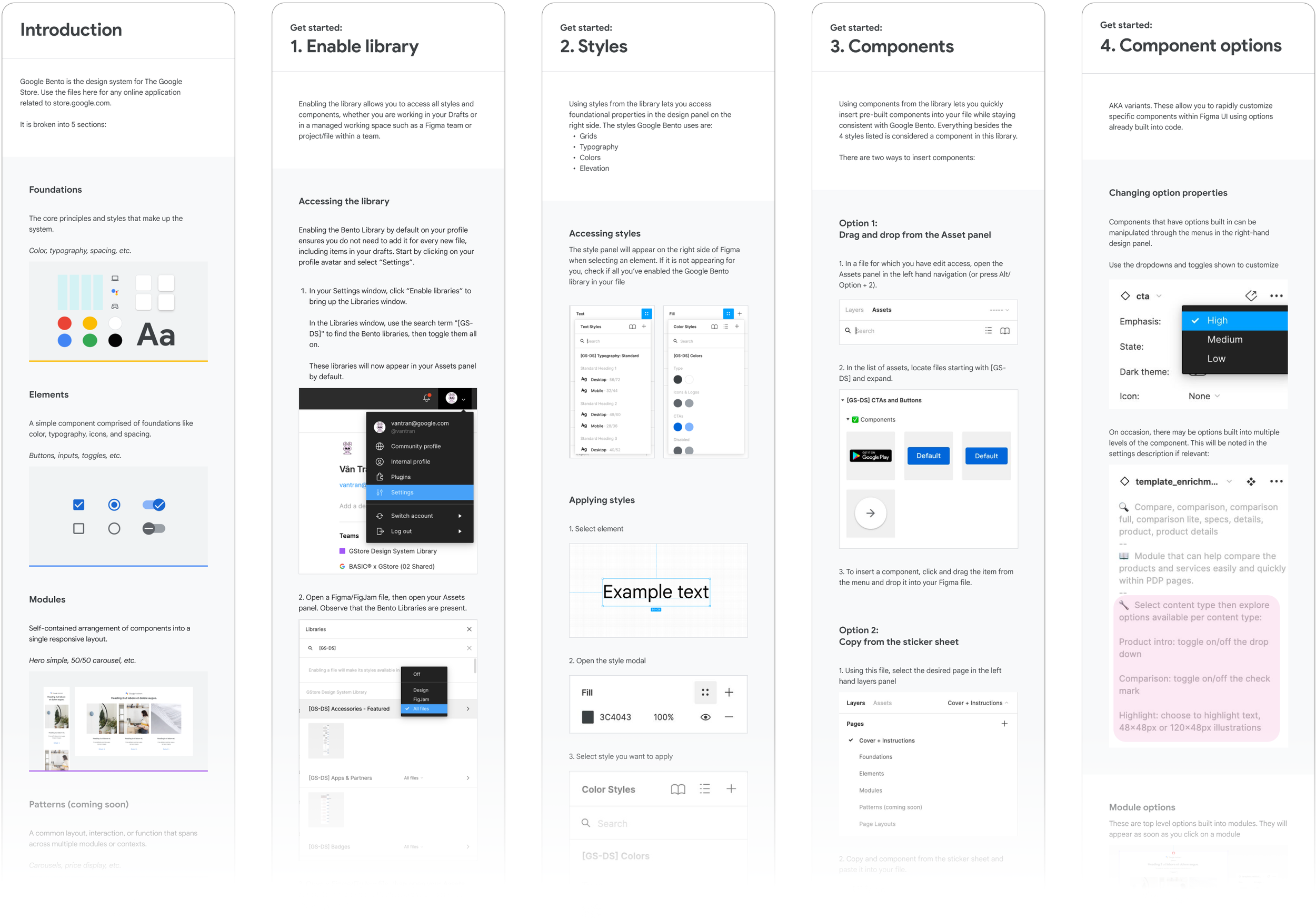
Team, User Training
Early on in developing the system, the designers and I spearheaded user training within out team to help them understand how to best use the design system libraries within their Figma workflows. We conducted 3 sessions to cover topics and common use cases they may encounter.
-
![]()
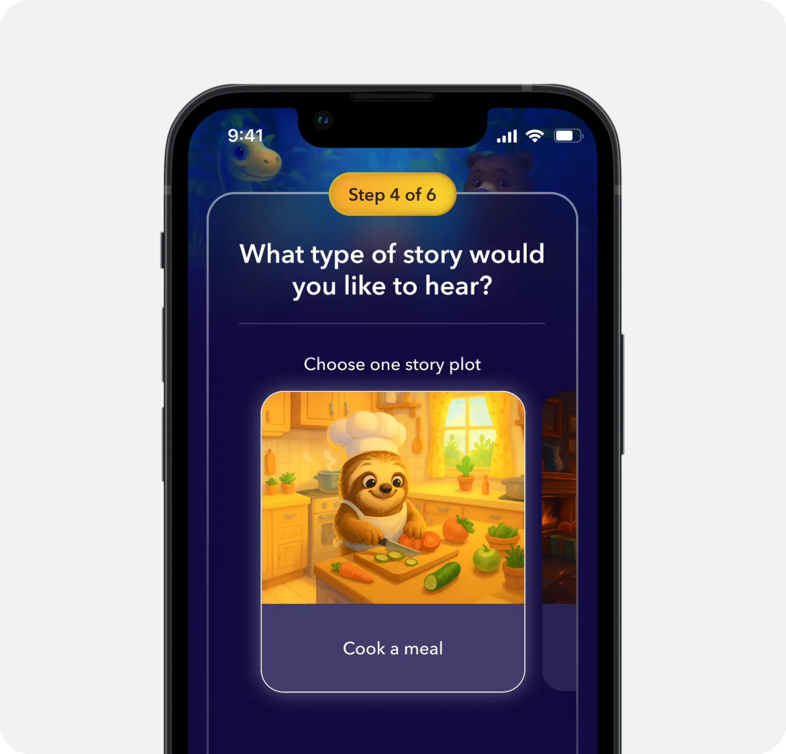
AI Sleep Stories for Kids
-
![]()
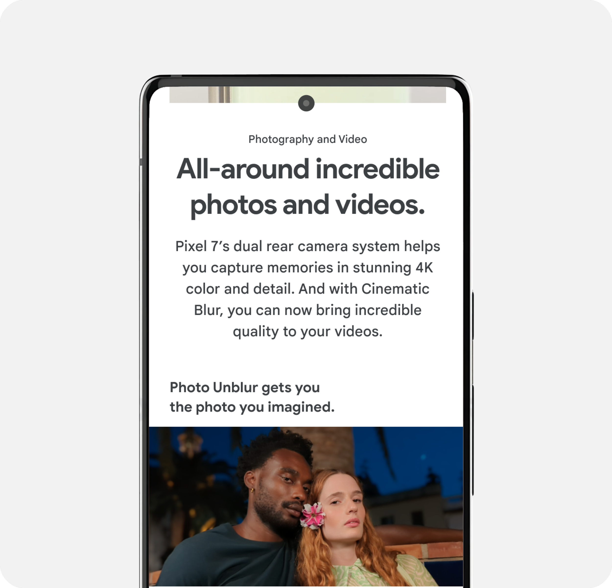
Key Selling Point Modules
-
![]()
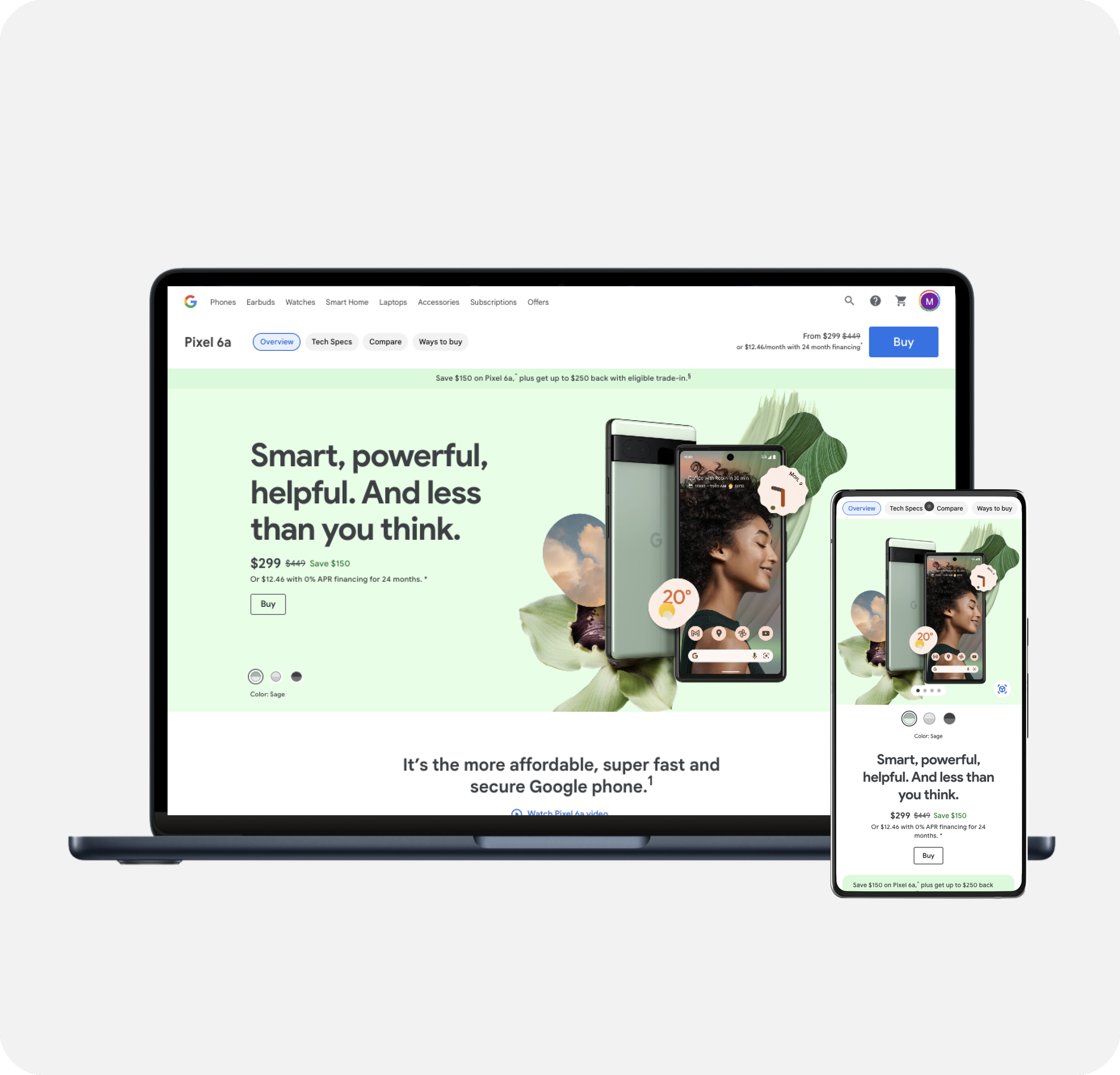
Product Detail Pages
-
![]()
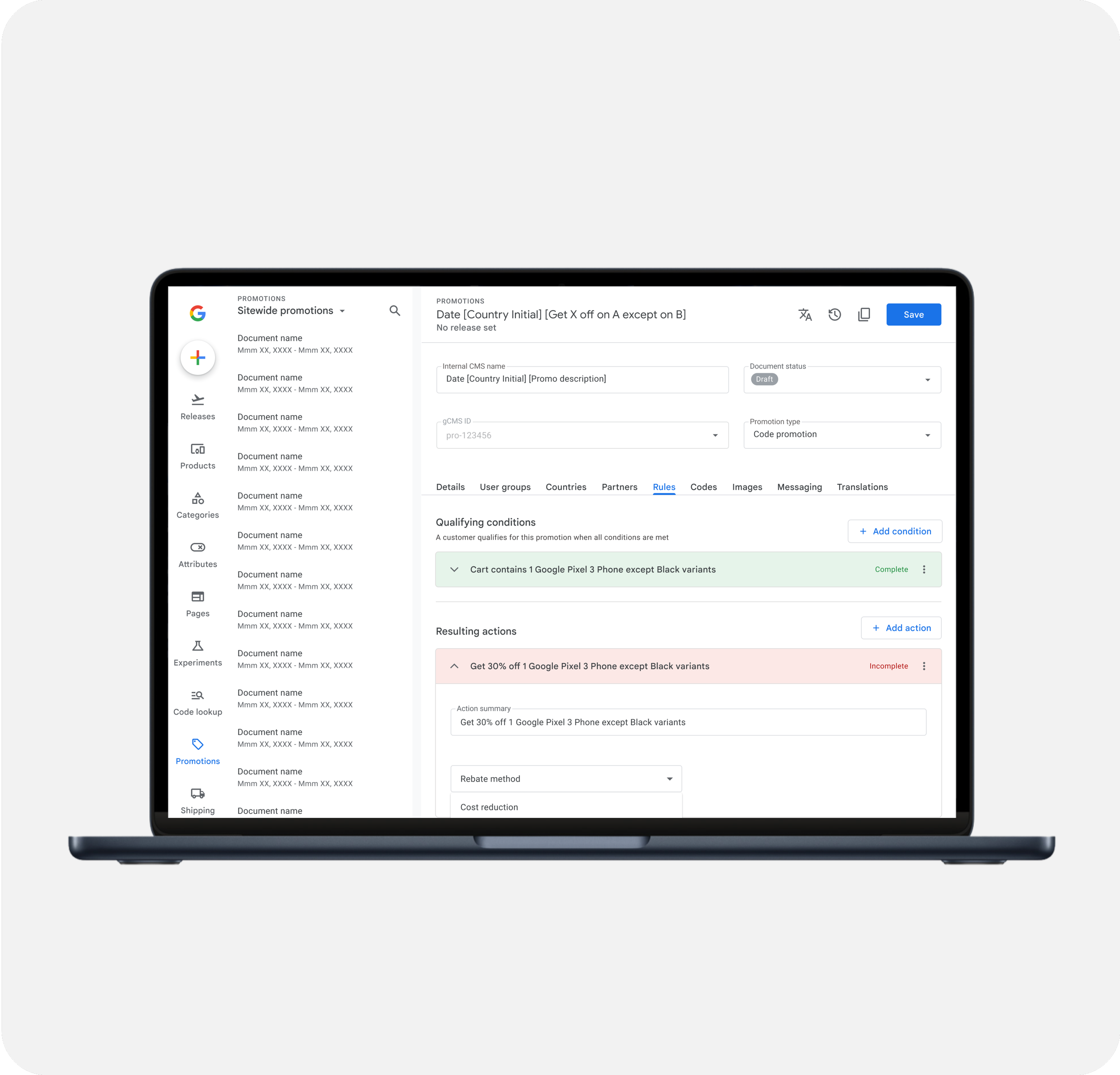
Promotion Management
-
![]()
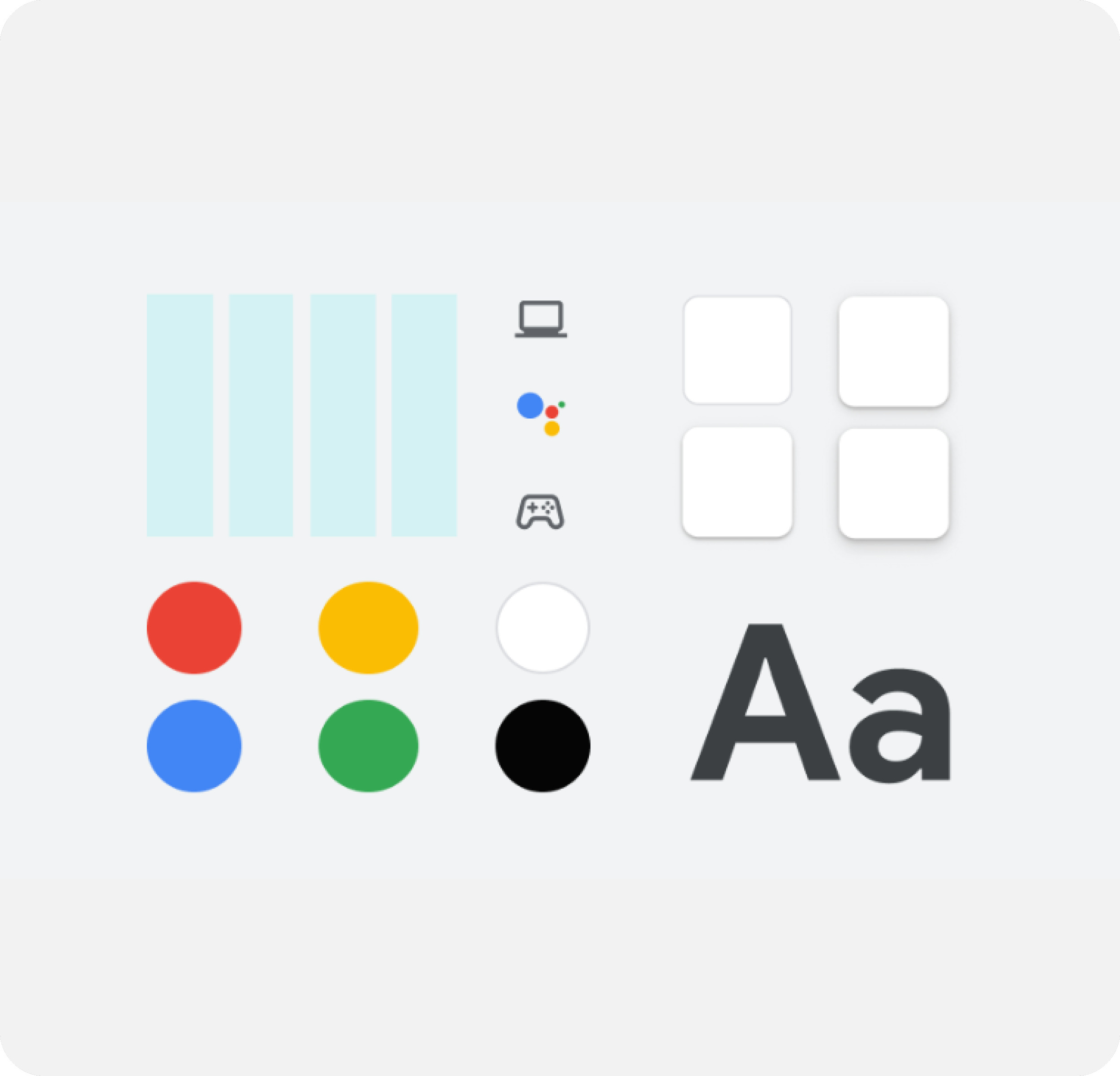
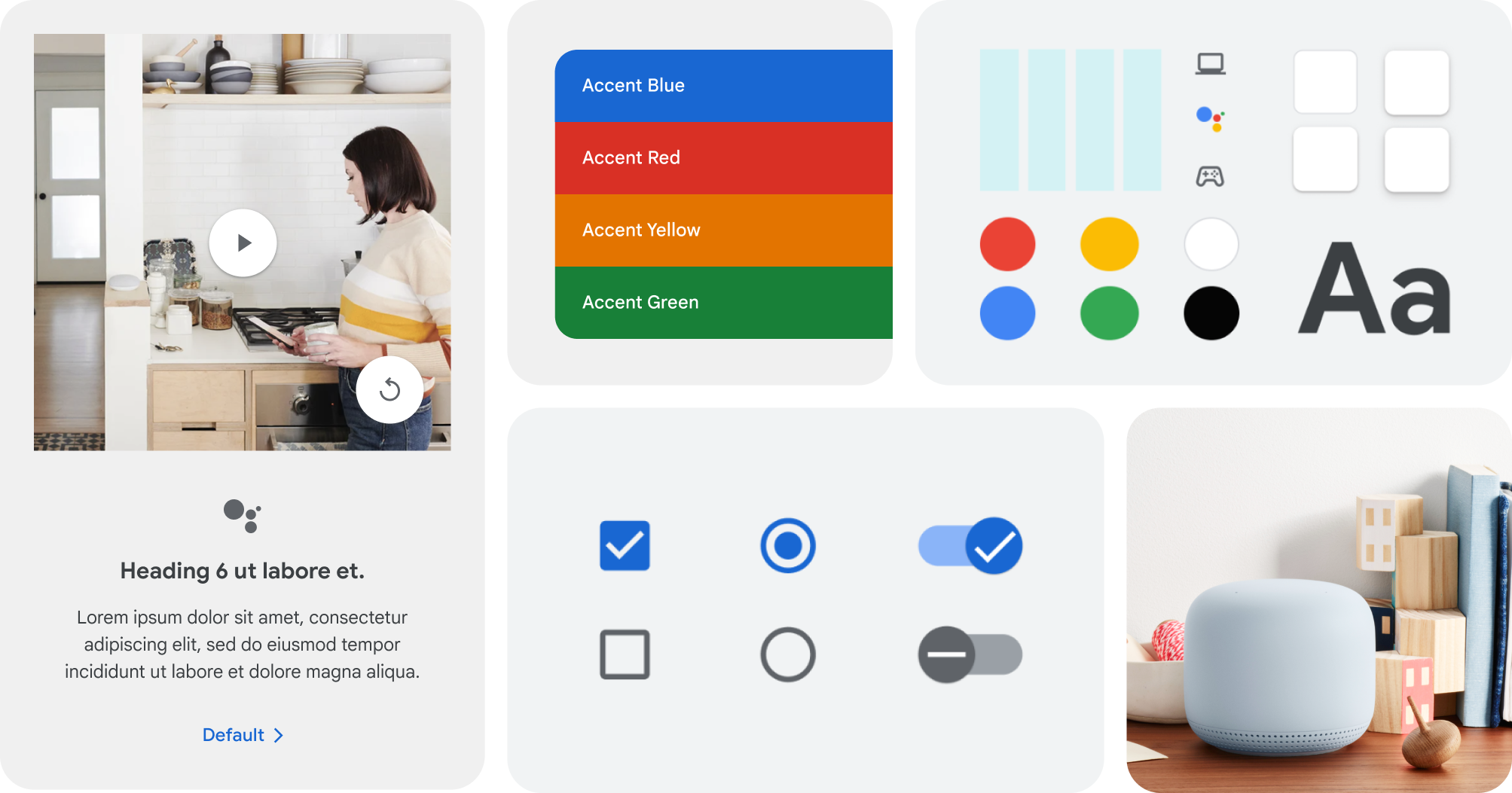
Google Store Design System
-
![]()
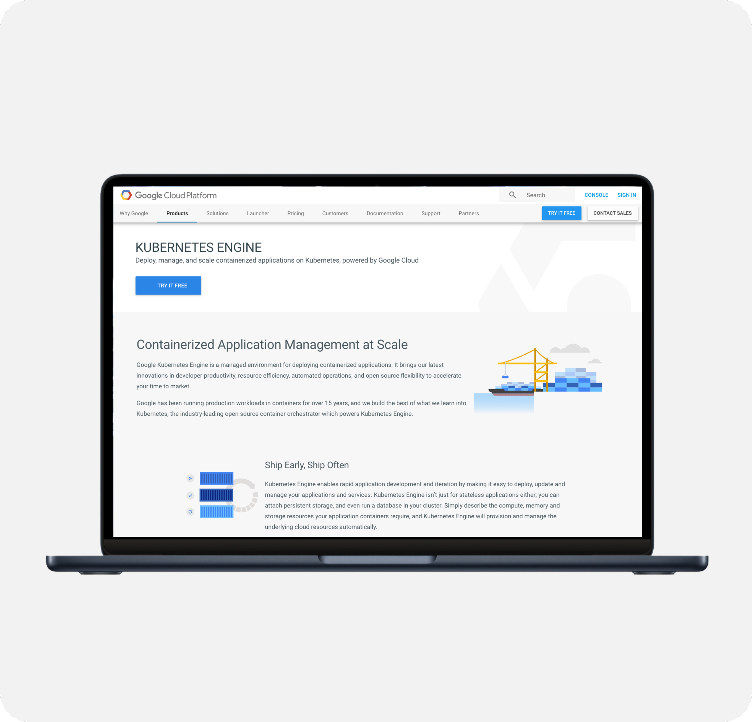
Google Cloud Imagery Refresh
-
![]()
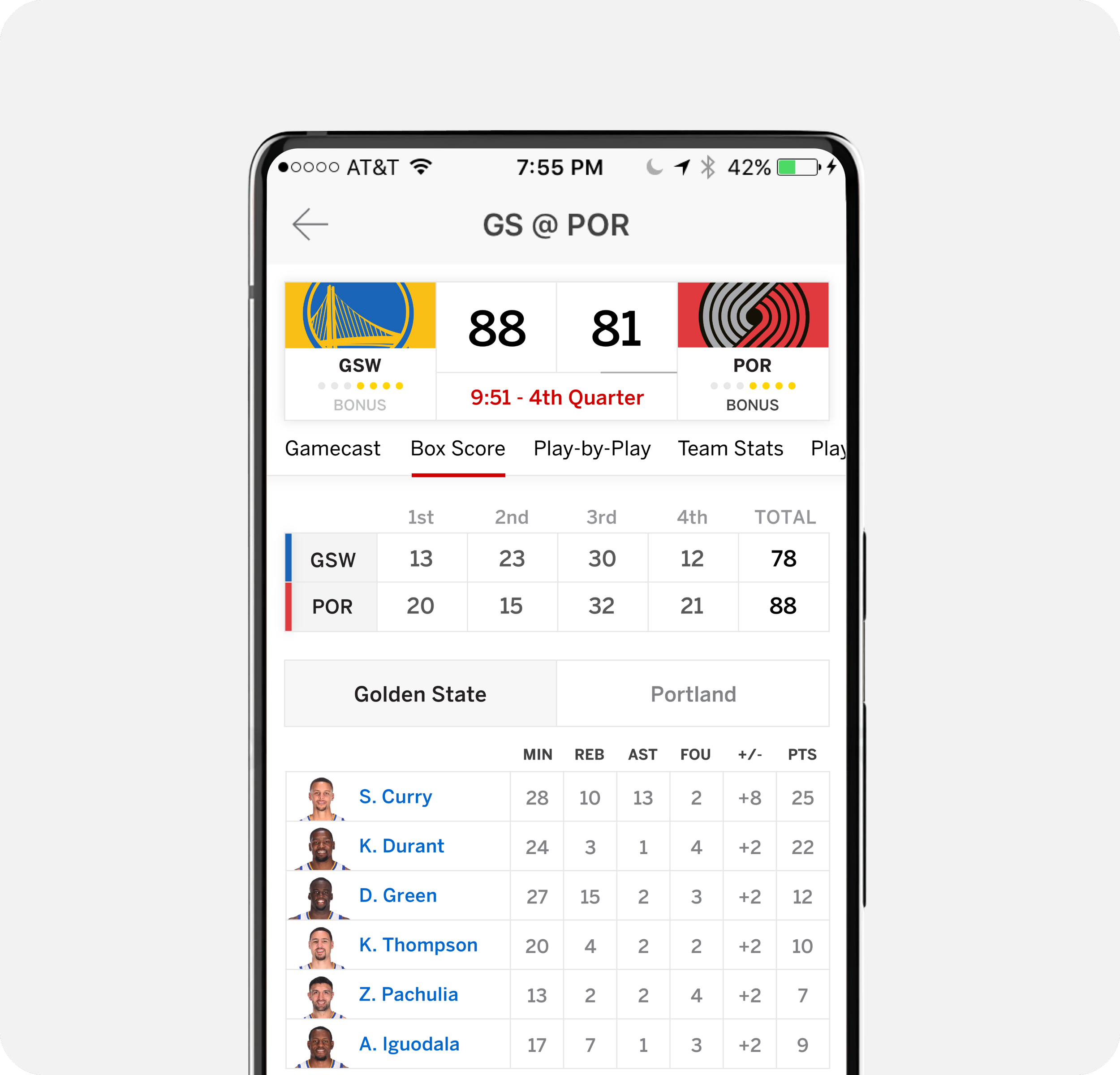
ESPN App - Gamecast