ESPN App - Gamecast
Personal
Introduction —
I'm constantly checking the ESPN app to get the most recent scores of the day — it’s the standard and global leader for professional and collegiate sports. Although they completed a lovely app redesign in 2018, I thought the experience could use some tweaks. I redesigned the Gamecast experience.
Role, Duration, Platform —
Design Lead, 7 days, Mobile App
Contribution —
UX Design, Visual Design, Art Direction
Approach —
Increase copy legibility
Improve visual hierarchy
Increase visual vibrance and clarity
Providing alternate interpretations to the minimal and simplistic redesign

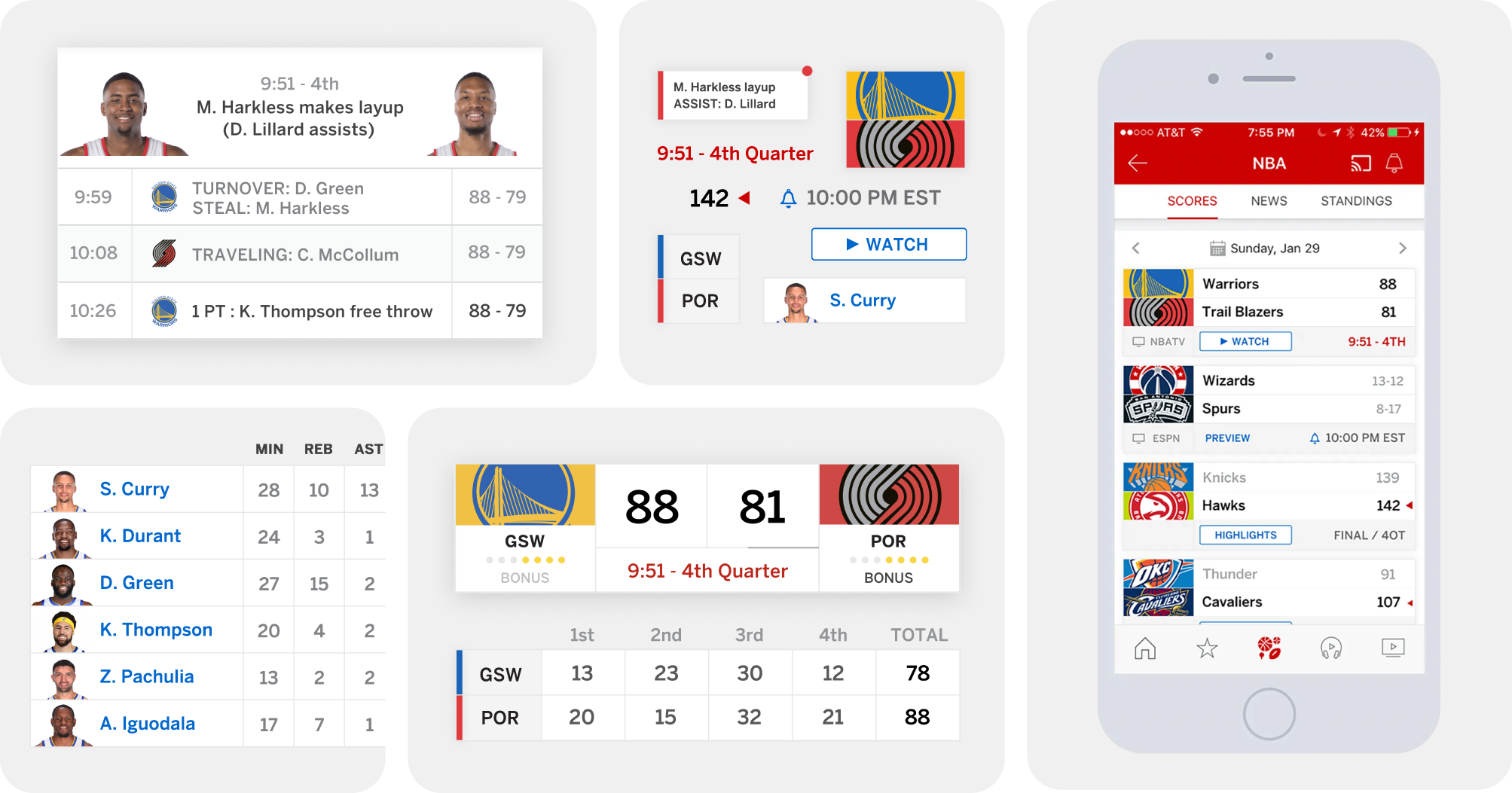
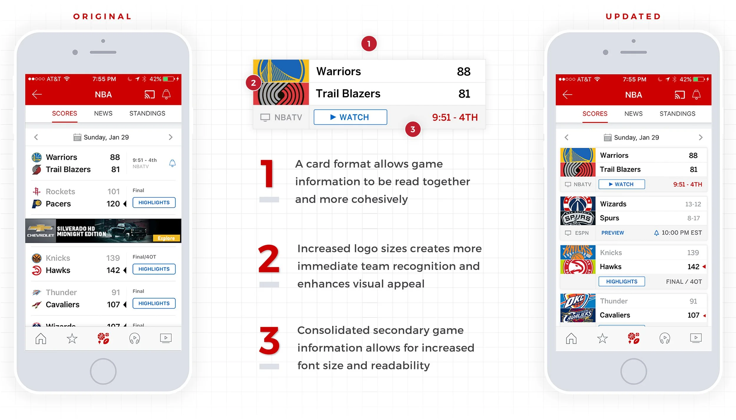
Scores Tab —
I focused on tightening information groupings, increasing visual appeal, and consolidating secondary game information
It's a challenge to identify the most important details that are crucial to understanding the status of a specific game, without going overdoing it. Ensuring that game information is read together was a key goal. It also pained me to see these wonderful, bold logos reduced to tiny marks. There was certainly an opportunity for some visual flair.
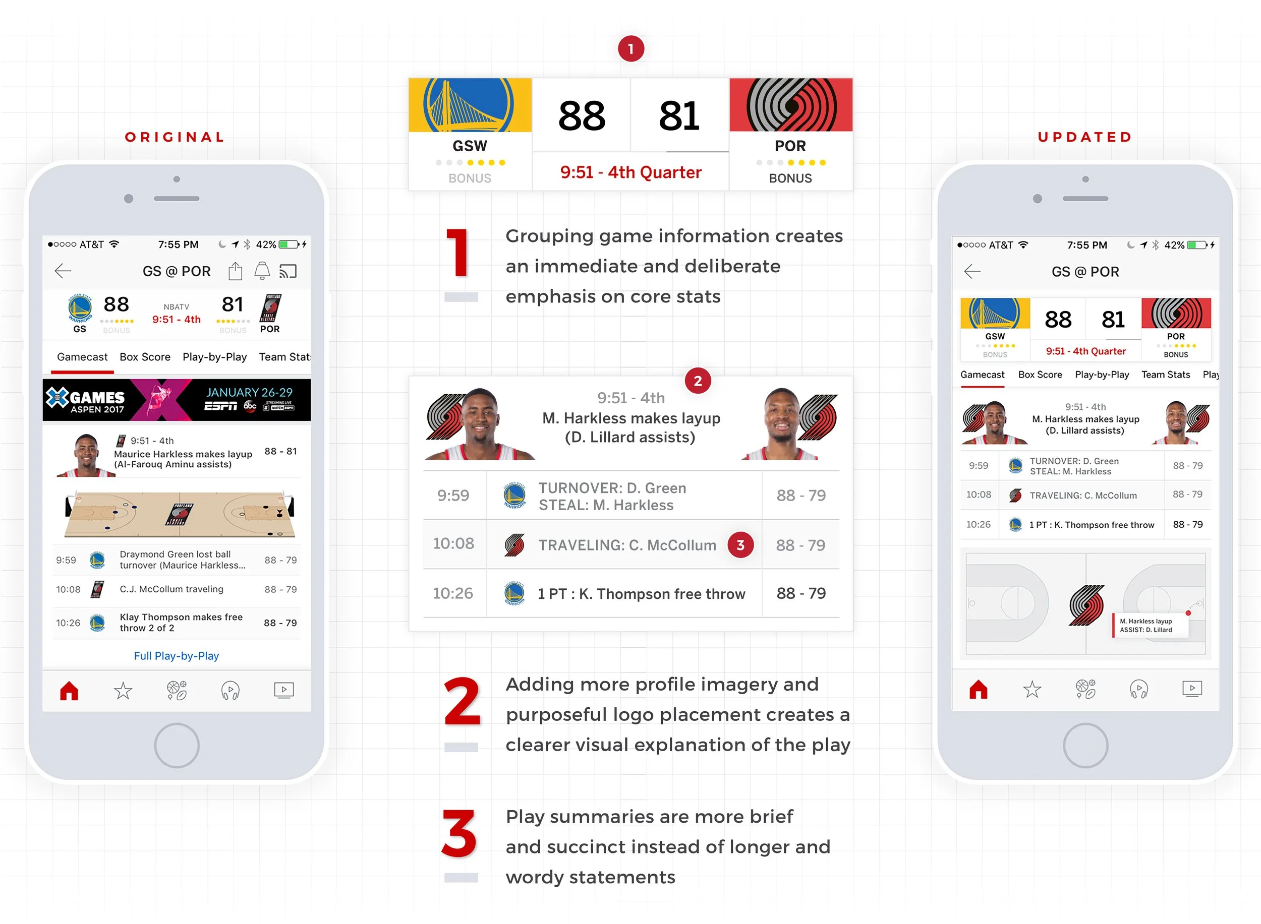
Gamecast, Main Tab —
I designed more intentional content groupings to reduce floating elements and made plays more brief and scannable
The Gamecast main screen is the most well-conceived layout in the whole app. The visual balance achieved when core game information is separated from the scrolling sub navigation bar and the truncated play-by-play, is truly a great solution. However, I felt some the information floated within their respective sections, and could use some structure to feel more resolved. By using a more modular approach, information can exist freely in their own spaces, while providing a chance to feature the logos more as well.
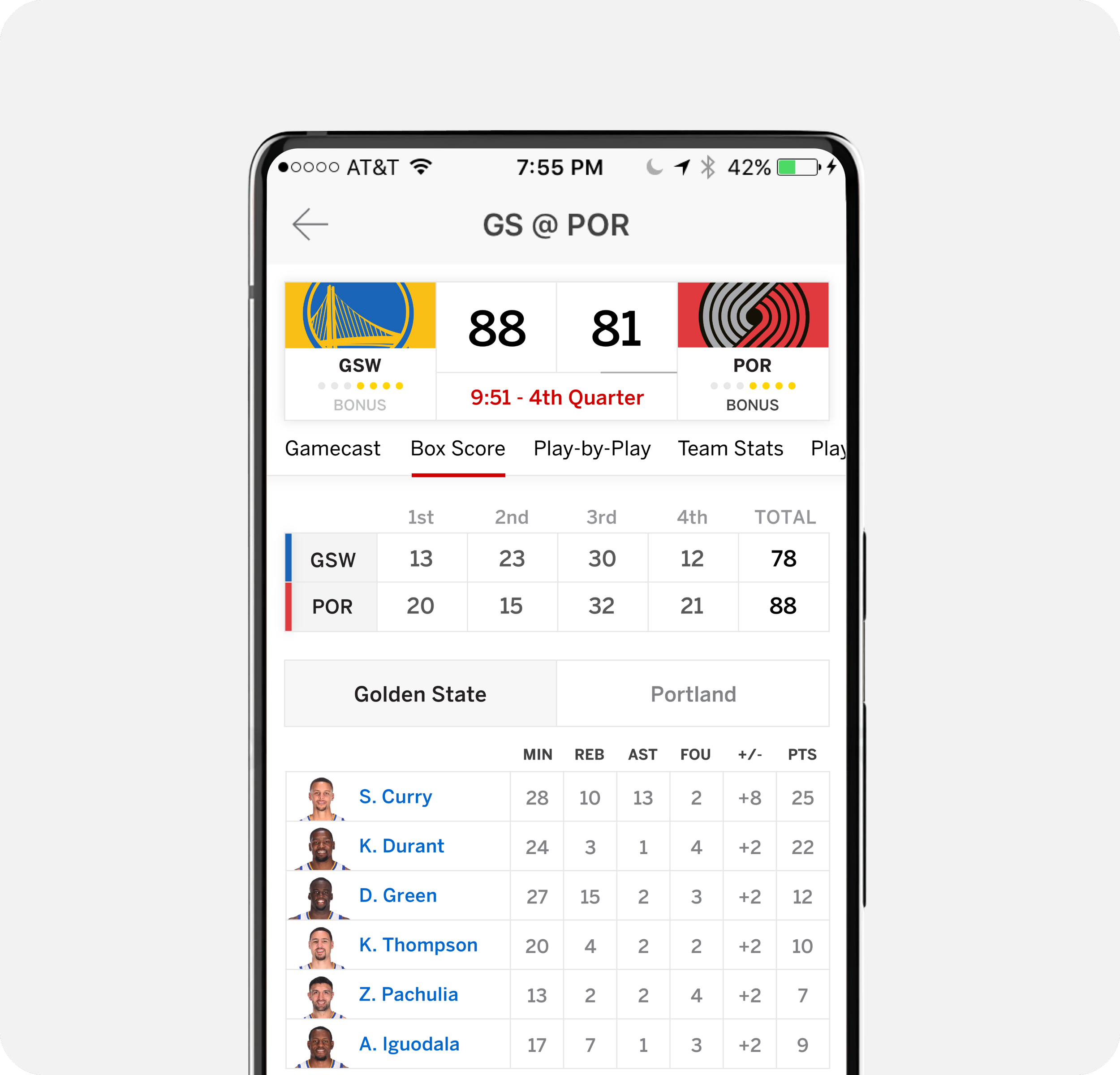
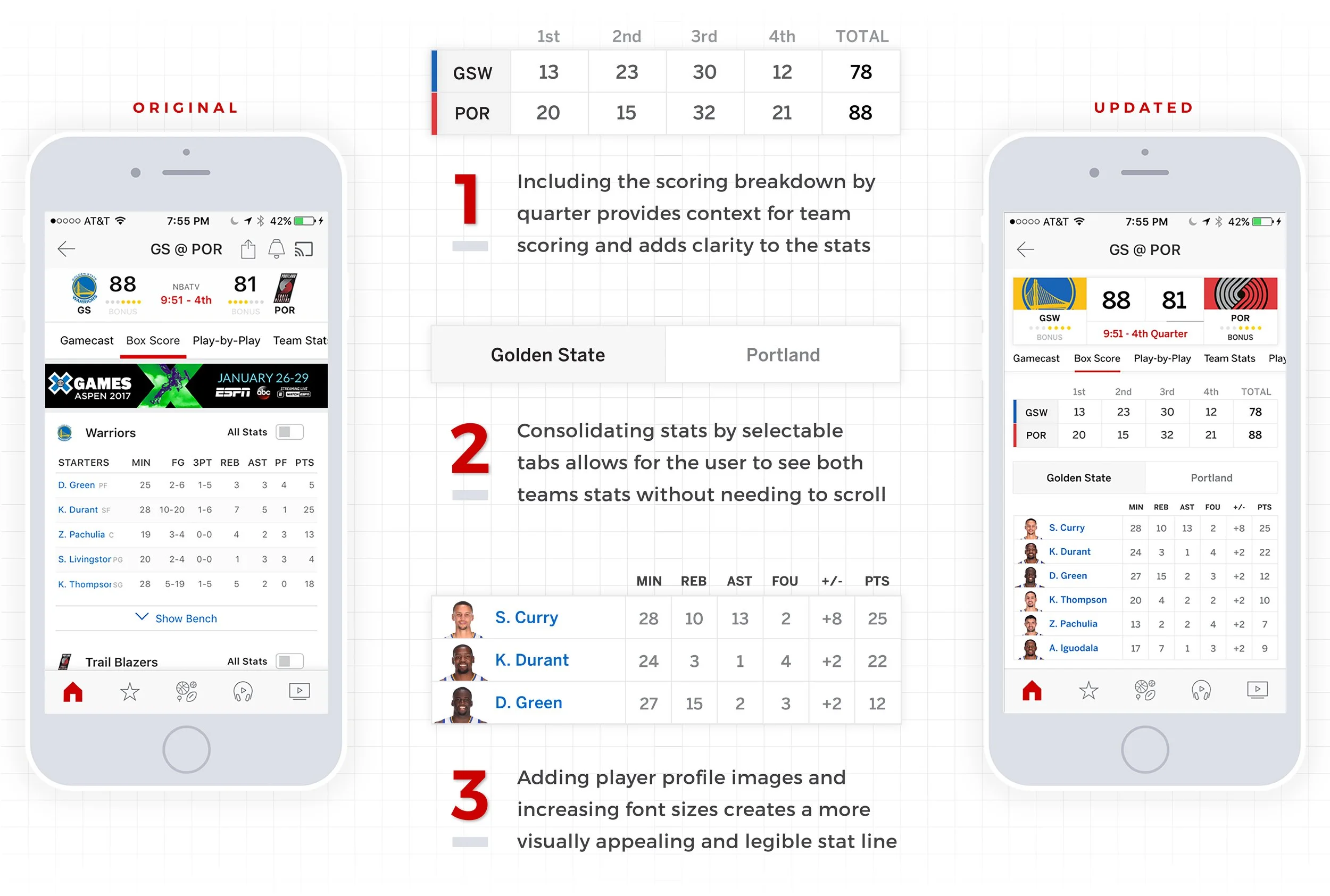
Gamecast, ‘Box Scores’ Tab —
I brought buried game information above the fold, minimized required scrolling, and added visuals to reduce dependence on copy in order to digest information
As a user, my key pain points pertained to retrieving game information through excessive scrolling or searching for information that exists beneath the fold. It was important that critical information was easily visible. Inserting player imagery also enhances the visual appeal and breaks up the abundance of text and numbers.
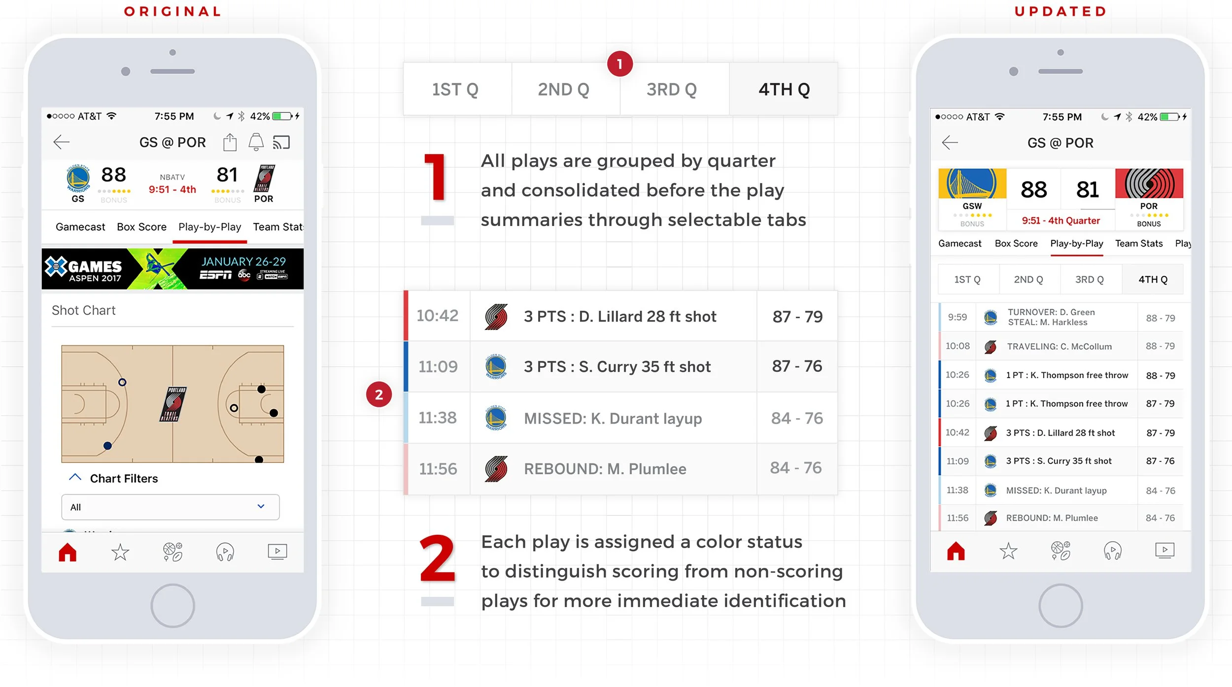
Gamecast, ‘Play-by-Play’ Tab —
I reorganized information into more accessible subtabs and used color to make information quicker and easier to understand
Adopting the tab approach within these screens was crucial to categorizing information with the intention of reducing vertical scrolling. I completely eliminated the shot chart in an effort to free up space and prioritize information. Seeing a shot chart as the first element in a play-by-play section felt disconnected, especially when the user must scroll down further to find any meaningful context for the dots on the court.
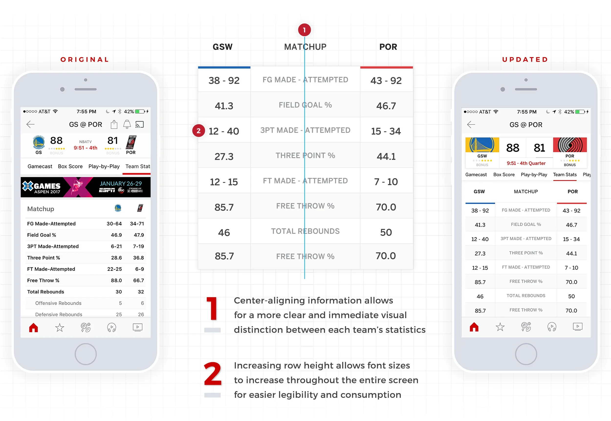
Gamecast, ‘Team Stats’ Tab —
I leaned on alignment to create a more visually balanced and logical solution
The Team Stats subscreen was an obvious solution. The core game information is naturally laid out in an asymmetrical way, dividing team information in opposite columns reads more smoothly and allows the user's eye to track down the screen effortlessly without losing track of where they are on the screen. Anchoring the statistical categories in the center creates a more resolved solution in general.
-
![]()
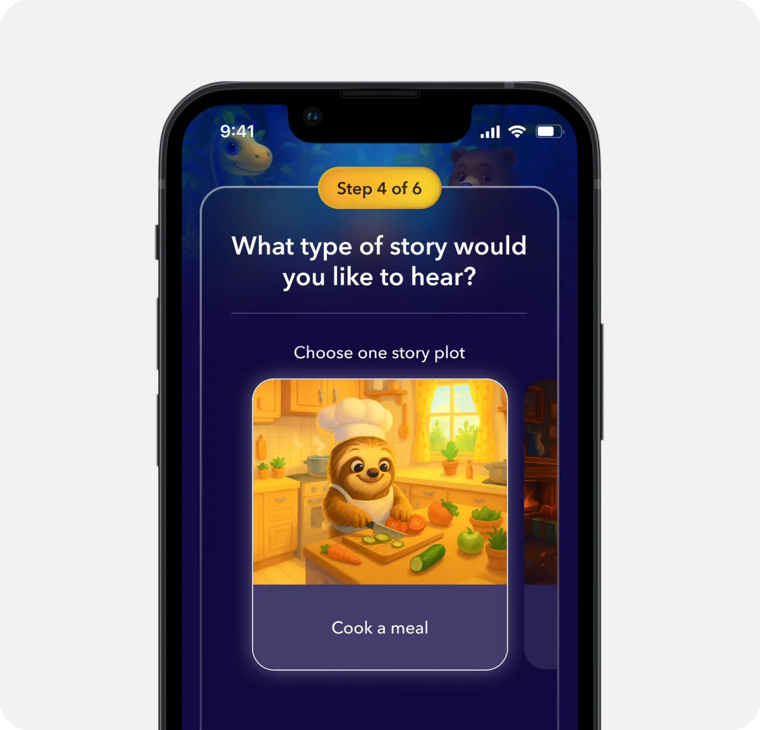
AI Sleep Stories for Kids
-
![]()
Key Selling Point Modules
-
![]()
Product Detail Pages
-
![]()
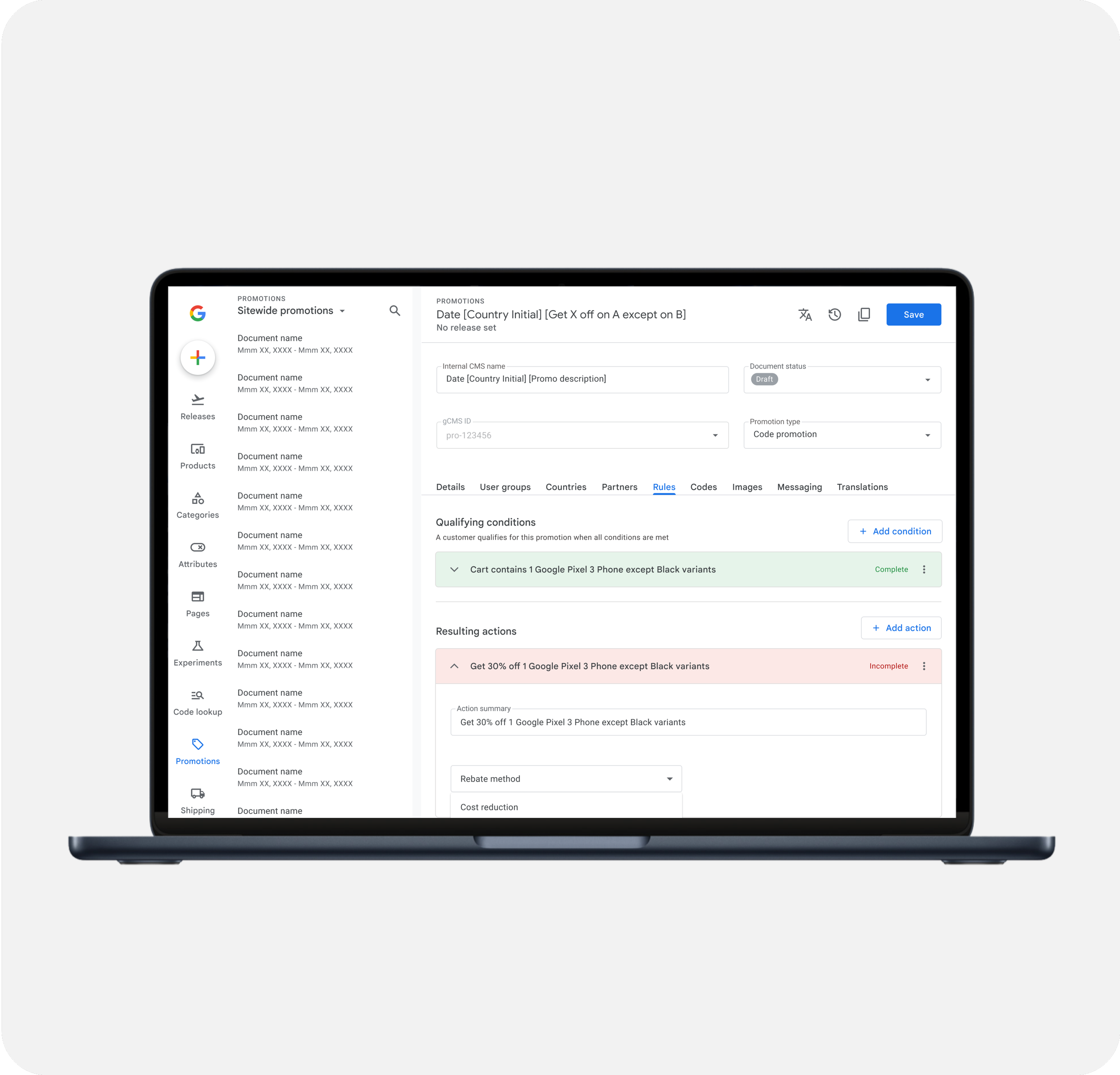
Promotion Management
-
![]()
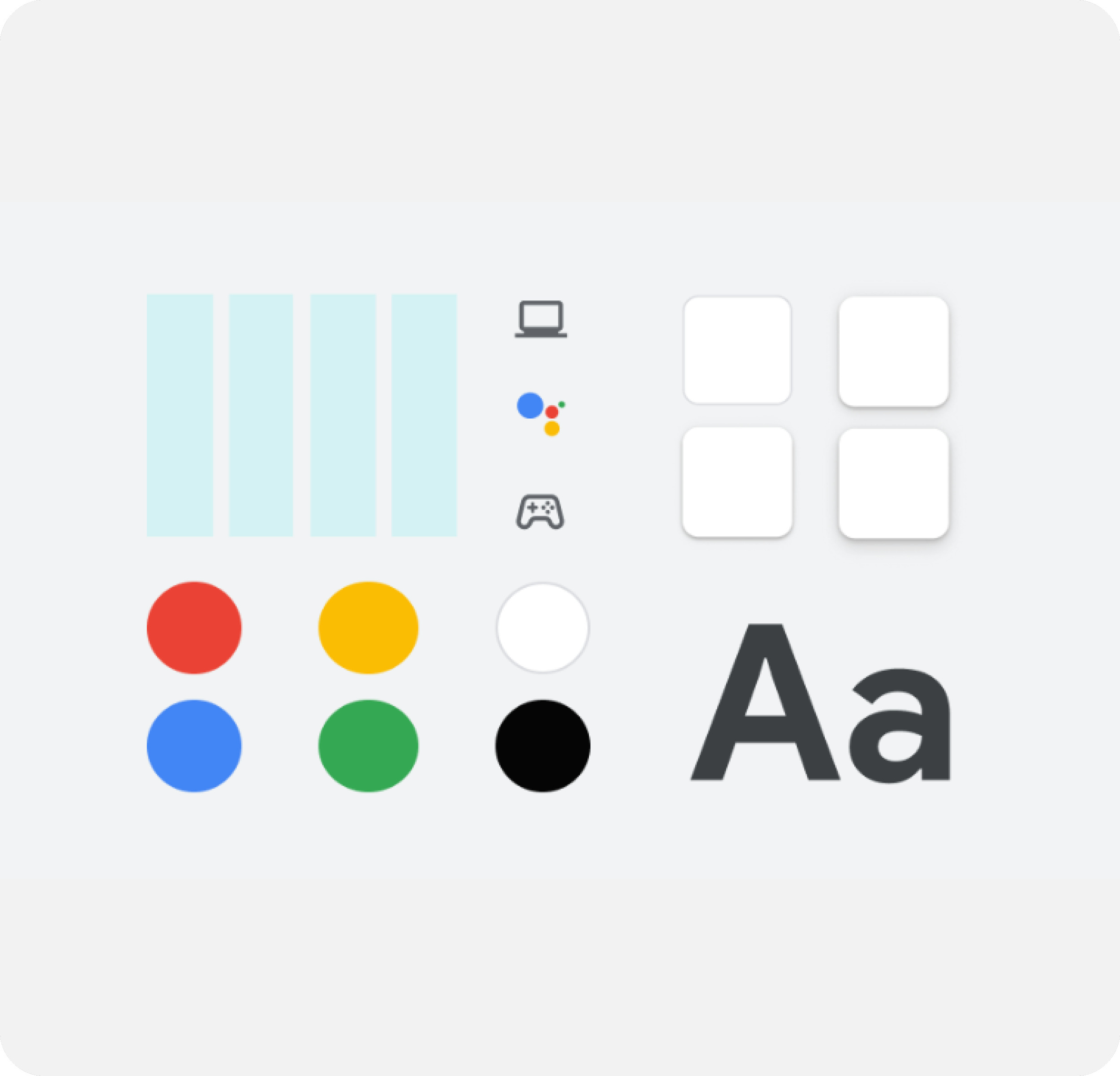
Google Store Design System
-
![]()
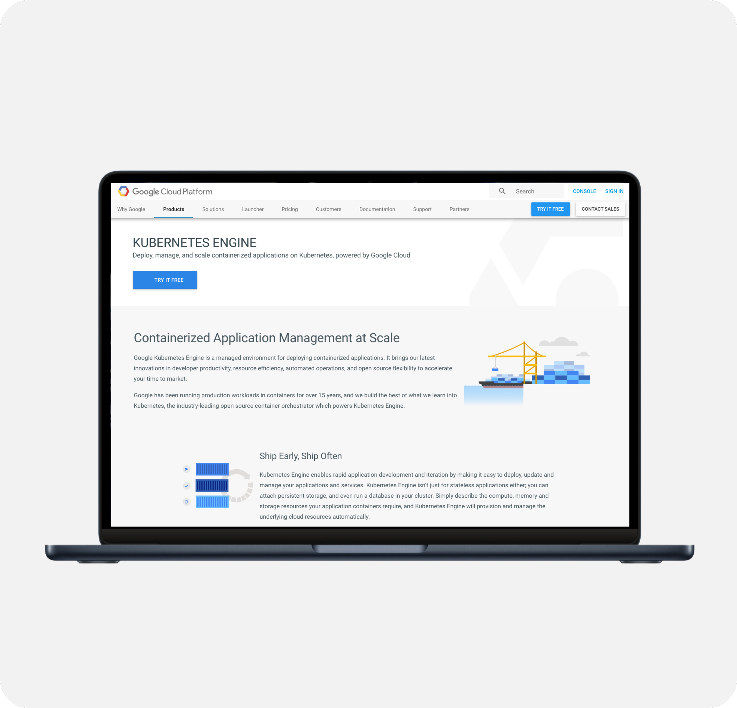
Google Cloud Imagery Refresh
-
![]()
ESPN App - Gamecast