Illustration Refresh & Guidelines for Google Cloud
Introduction —
I reinvented Google Cloud’s illustration system and provided guidelines for marketing future products.
Role, Duration, Platform —
Design Lead, 9 weeks, Web
Team —
UX Manager, Marketing team
Contribution —
Visual Design, Art Direction, Vector Illustration
Problem —
Google Cloud Marketing was having trouble making products easier to understand and more accessible to a broader business audience.
Context —
Style and guidelines needed to be quickly replicated given product launch frequency each quarter
Existing solutions were completely random and without a systematized approach
Outcomes —
⭐️ Strengthen brand connection to the Google Product Ecosystem
⭐️ Created long-desired visual consistency to marketing pages
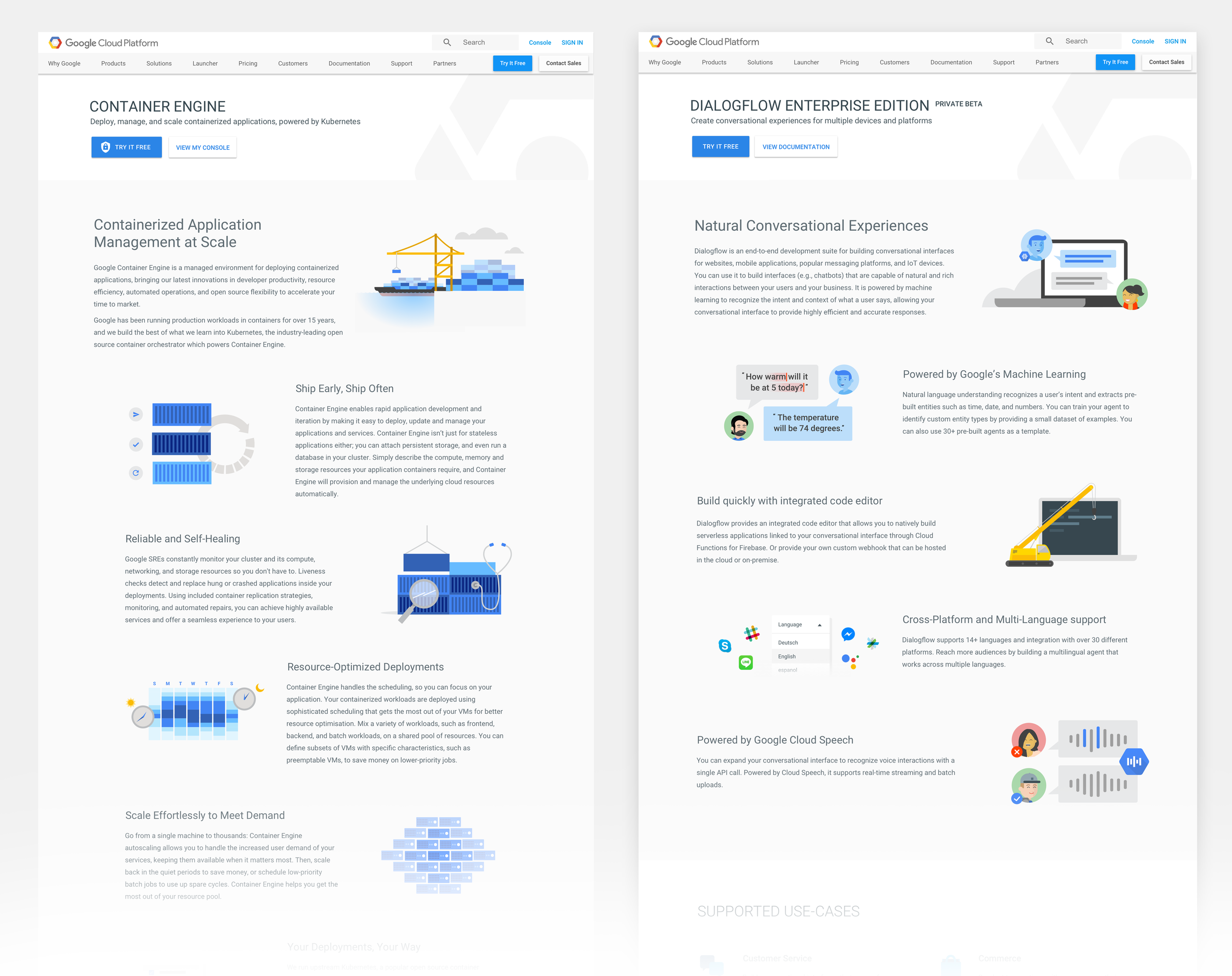
Solution Highlights —
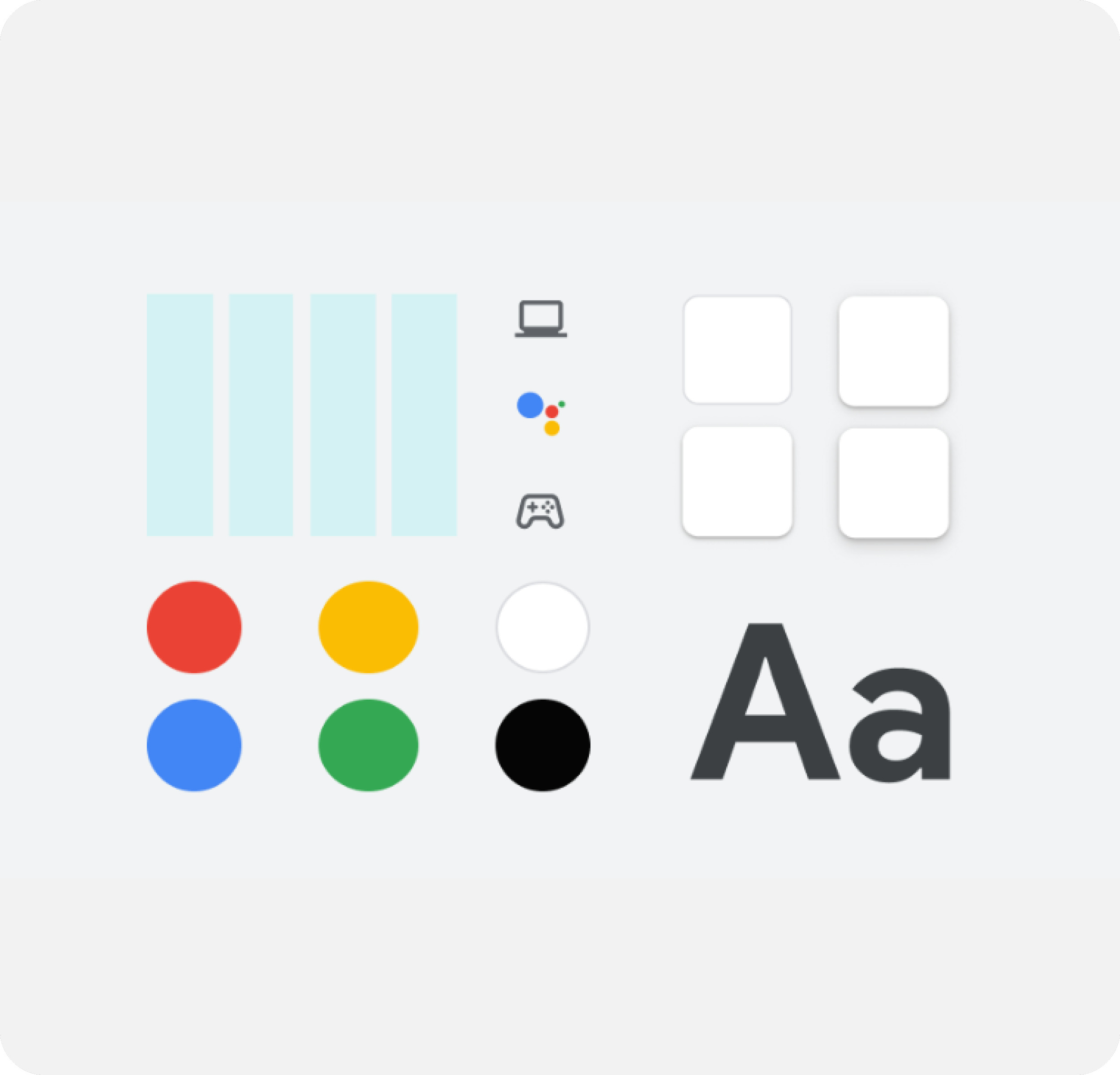
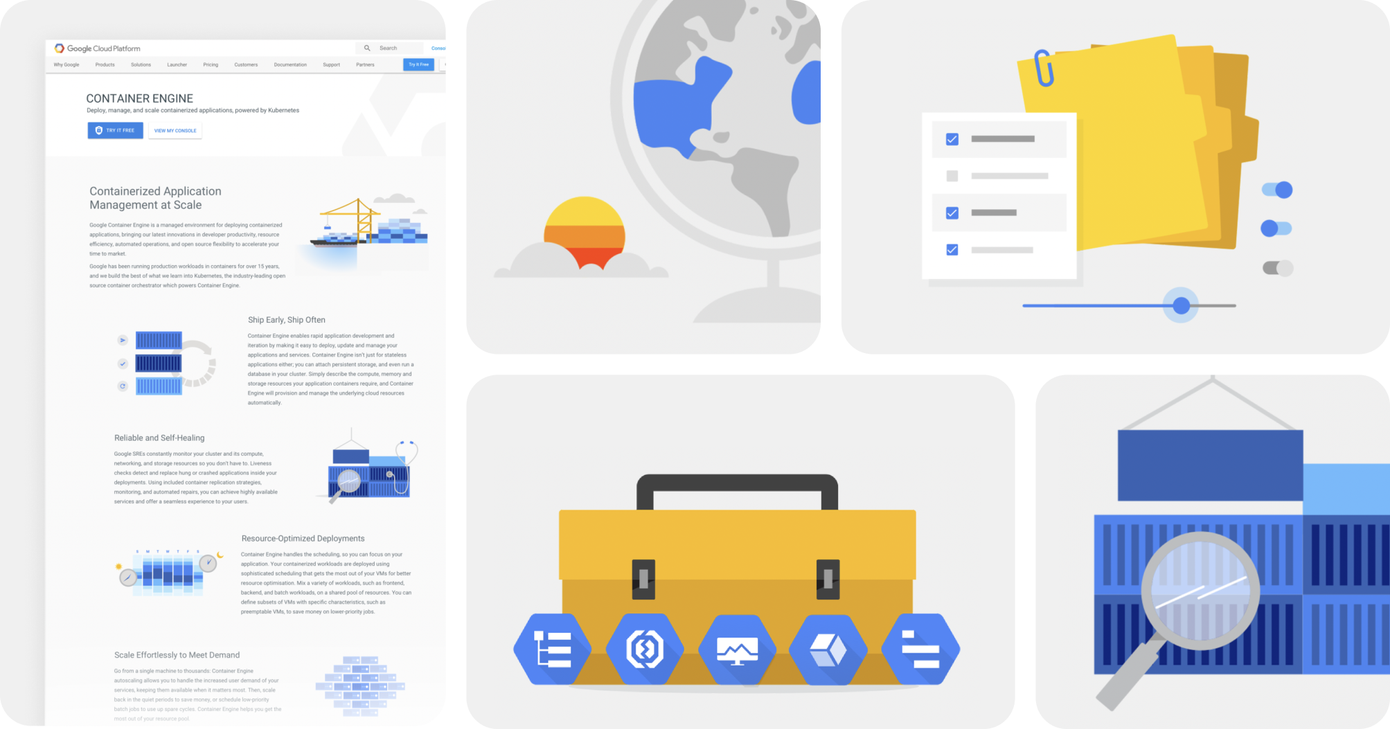
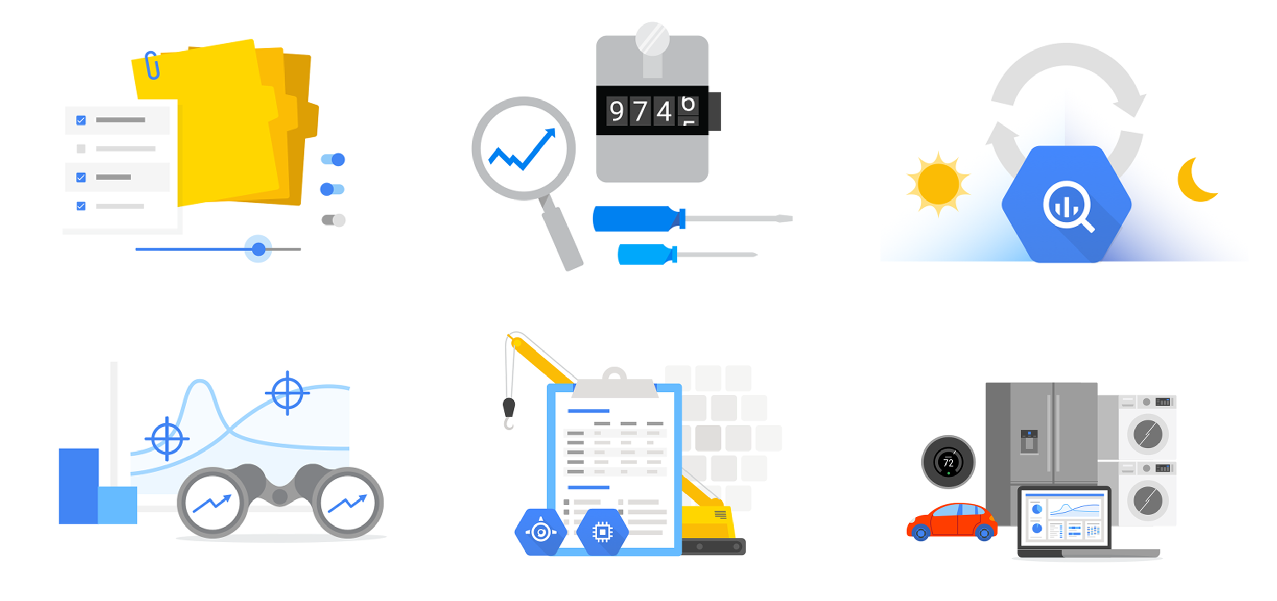
I chose a consolidated and simplified palette that adopted the bright tone used in Google imagery
By adopting a shared color palette, illustrations would have a foundational thread in common to be related or viewed as a family. Creating a simplified, Google-approved palette was an easy way to cue visual connections between images to show they belong together.

Solution Highlights —
I adopted a Google-inspired Illustration tone and style, replicating it as closely as possible
I studied existing illustration styles used by the Web Marketing teams and chose to use existing components and build custom elements when necessary. Taking into account attributes like perspective, shading, amount of detail, and color usage- I was able to expand the family.
Solution Highlights —
I incorporated blue as a distinguishing color for Google Cloud products
Being merely connected to Google is not enough. Understanding what product or entity these illustrations belonged to was critical. Using a predominantly blue color palette could achieve this goal while not departing too far from the existing execution style.
Solution Highlights —
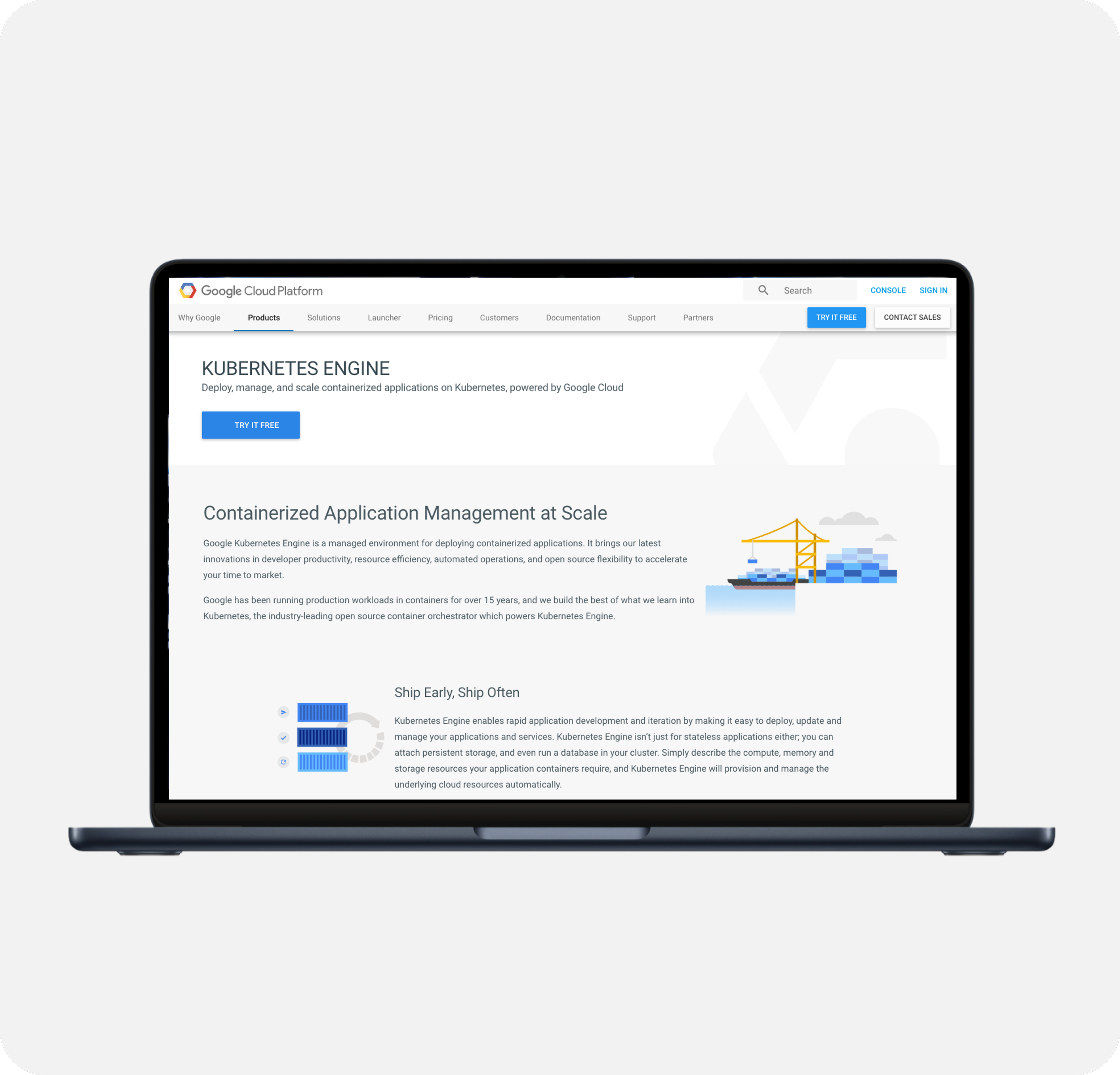
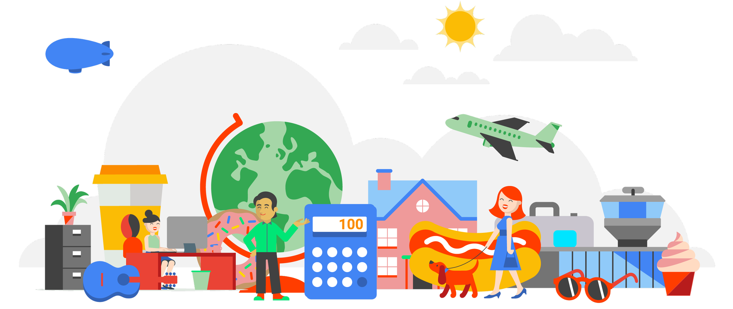
I chose to use more literal, tangible concepts that were easier to scan and understand
Shifting to conceptual direction, I addressed the need to appeal to a wider audience and for these images to be more easily understood. I veered away from abstract concepts and focused on more literal and tangible themes that could simplify and defuse the complexity behind these features. Using objects that were recognizable and lightweight was key.
Solution Highlights —
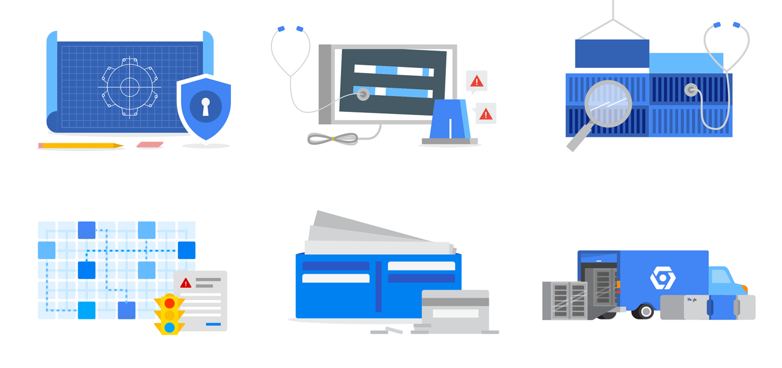
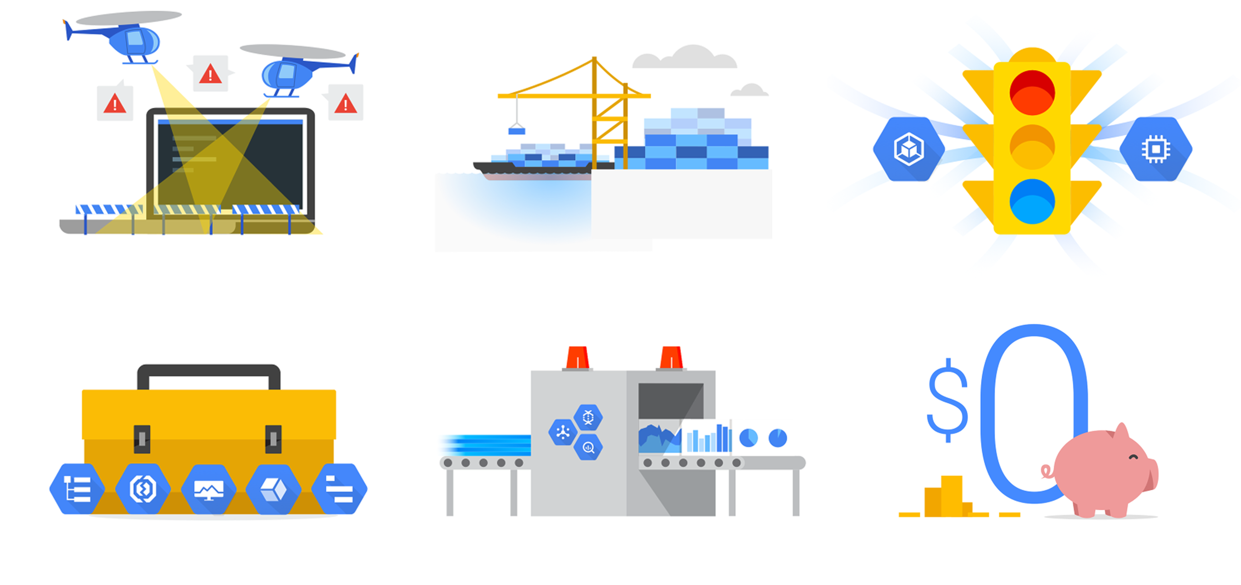
I composed concepts in collage, so their sum promoted quicker comprehension
After making many illustrations, I realized tangible concepts was not always a viable solution. Sometimes the source concept was so abstract, only pieces of the feature could realistically be portrayed. As a result, I focused on the key takeaways, chose a tangible representation for them, and merged them together in a collage composition.
Solution Highlights —
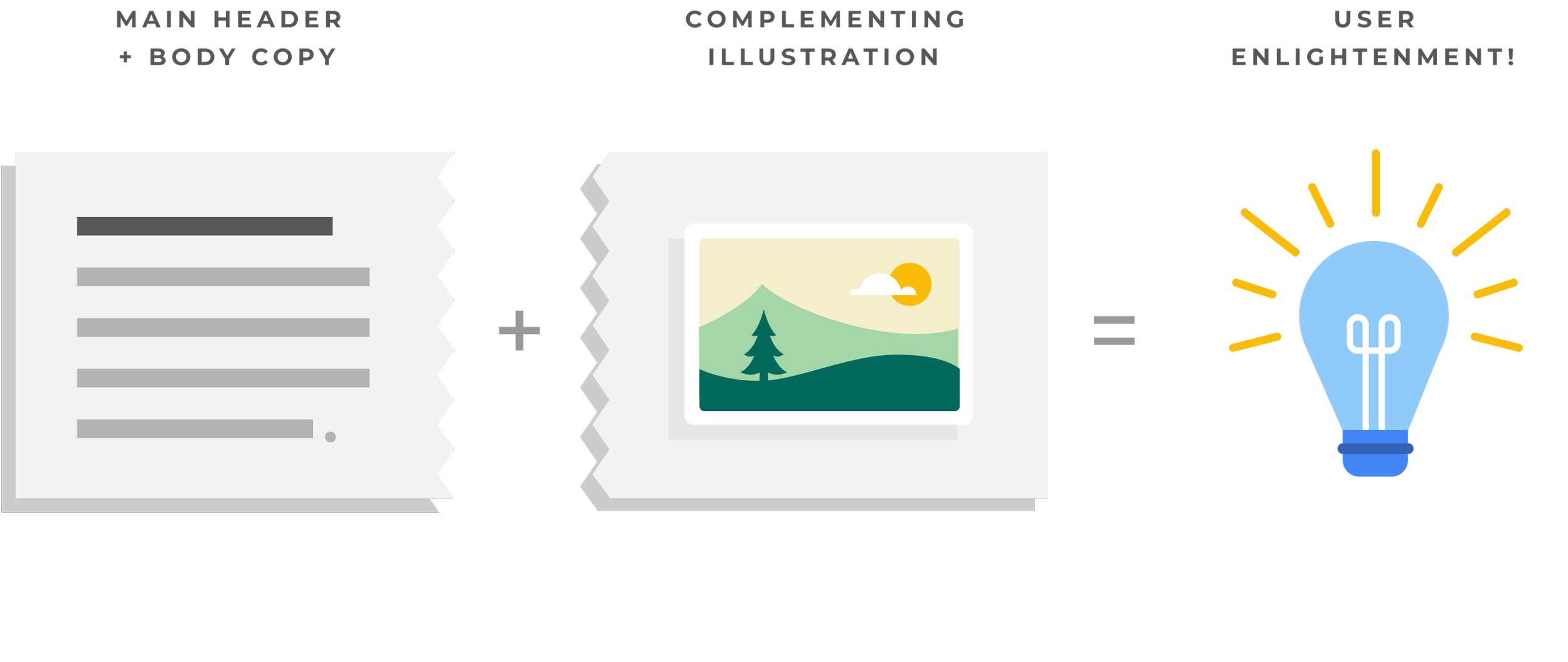
I also approached the imagery’s role as a complement or sidekick to comprehension, not the hero
It became clear the illustrations needed to complement the main header and body copy, and not as the hero or main feature. To expect these images to have an equal impact or proportionate understanding as the text was unreasonable.
-
![]()
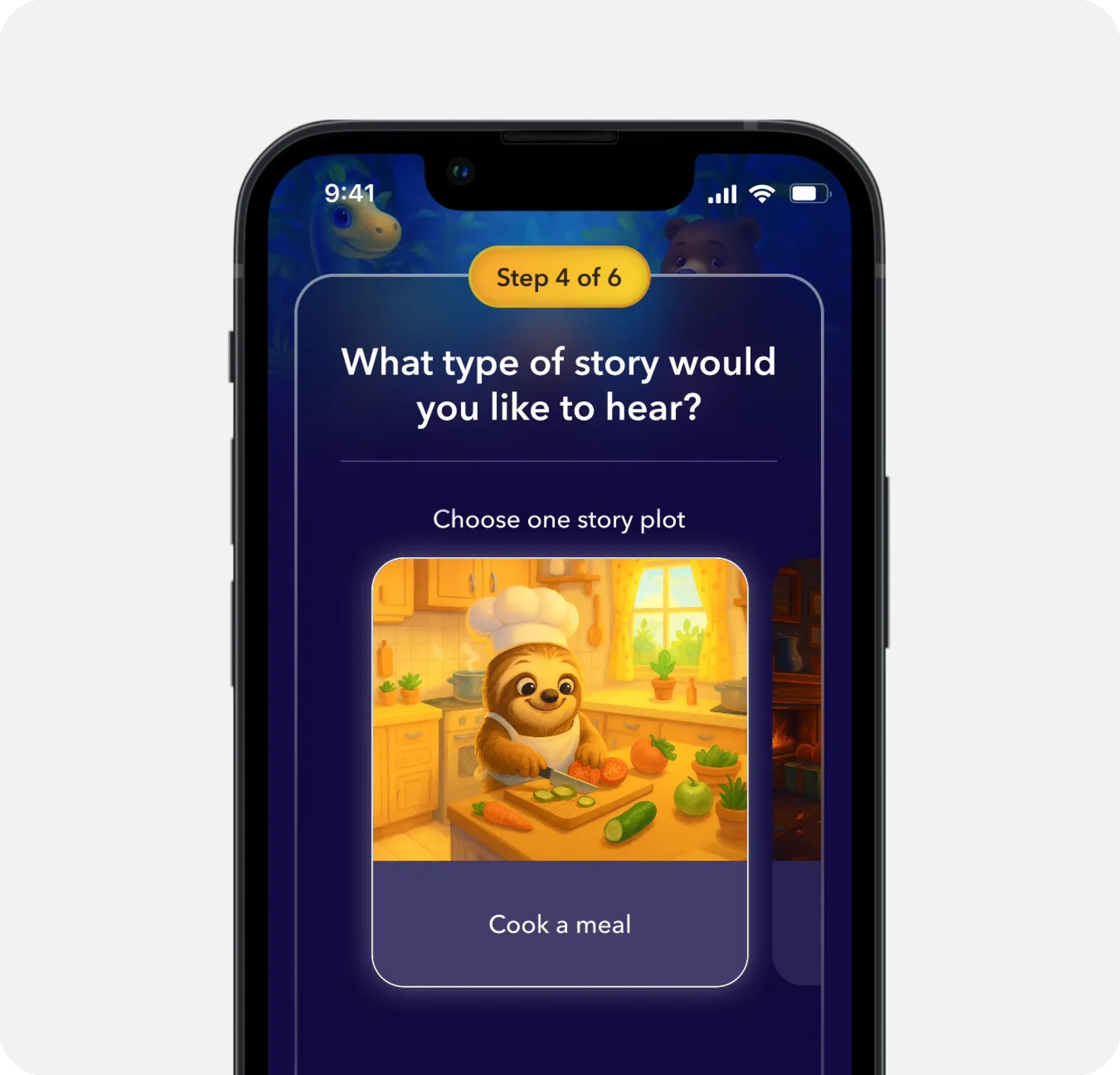
AI Sleep Stories for Kids
-
![]()
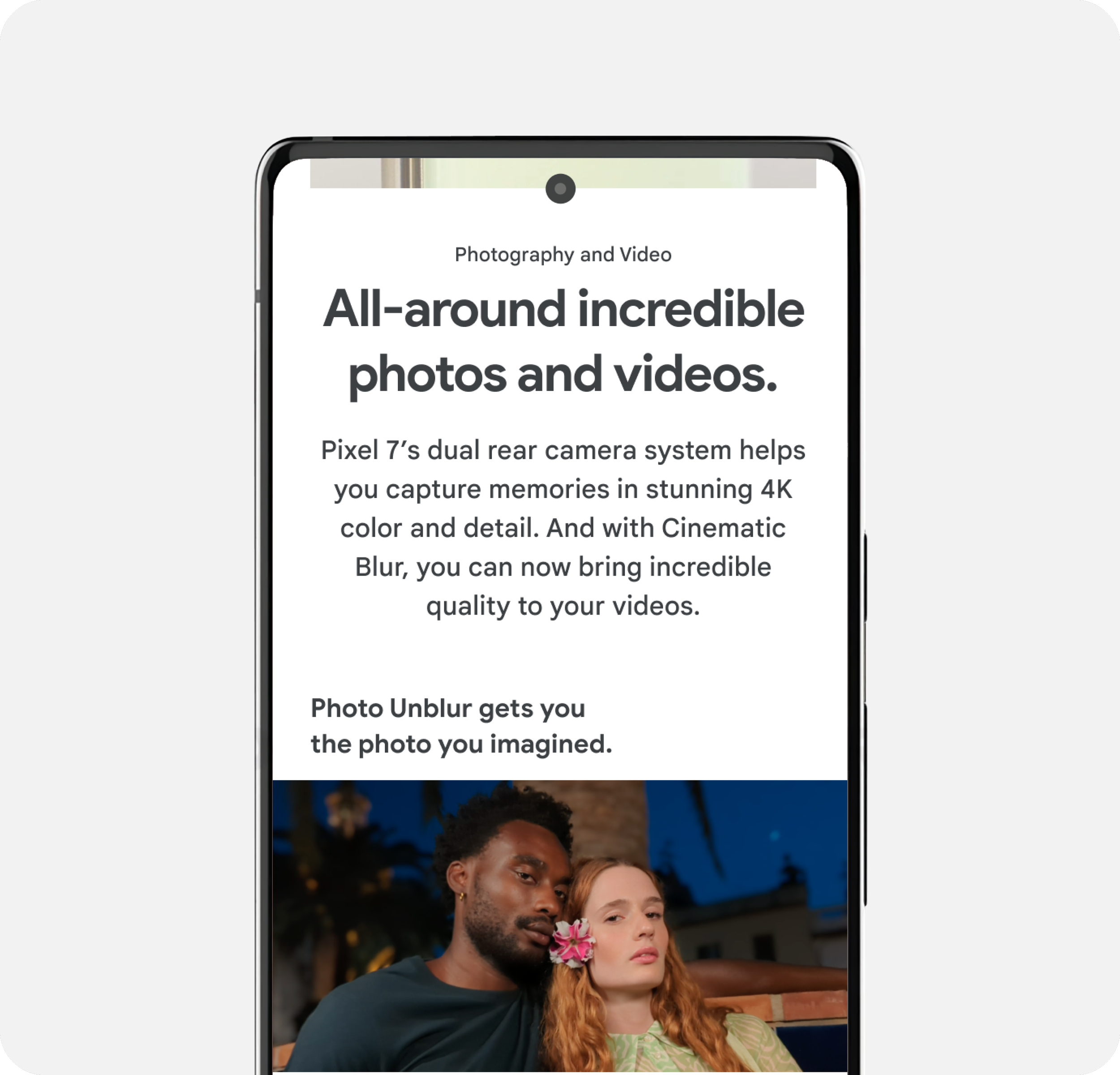
Key Selling Point Modules
-
![]()
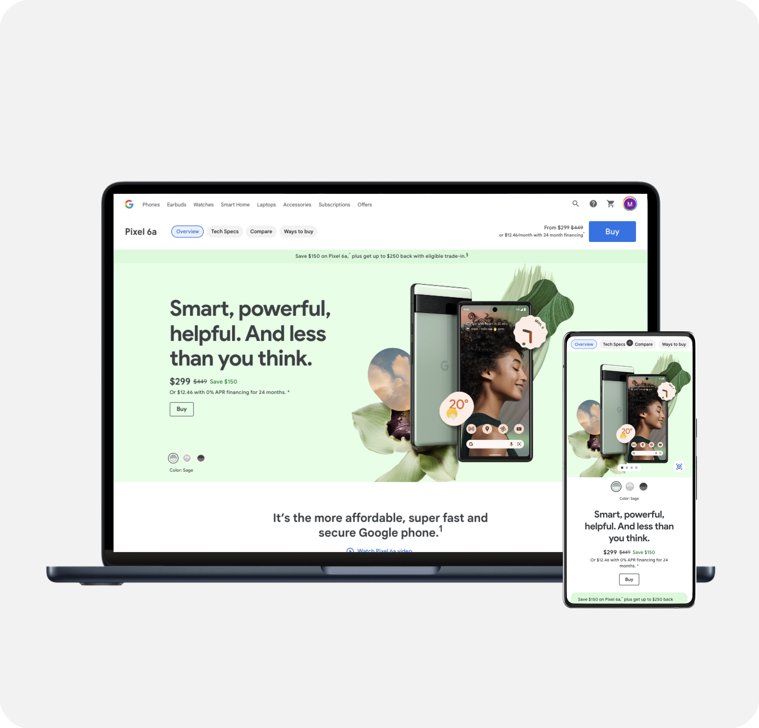
Product Detail Pages
-
![]()
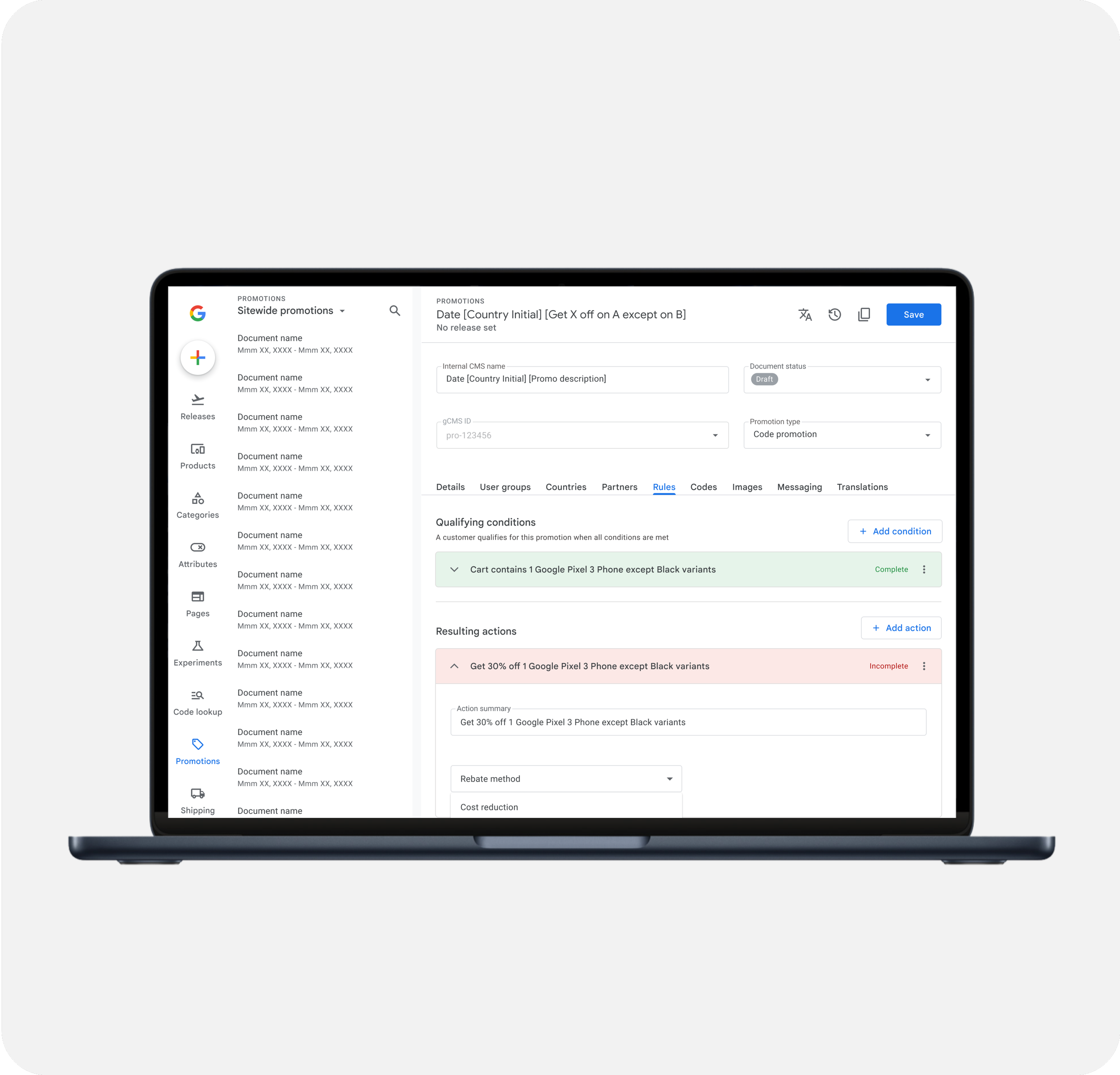
Promotion Management
-
![]()
Google Store Design System
-
![]()
Google Cloud Imagery Refresh
-
![]()
ESPN App - Gamecast